Design
How we designed the elespacio brand
May 2023A creative marketing agency spends a lot of time on brand positioning, defining tone of voice, visual identity, and so on, for their clients. But what goes into designing the brand for the agency itself? Do you go all out on the logo, or take a more subtle approach? How do you design a brand that designs brands? Creative director Mara Sylvester shares the secrets behind the elespacio brand.
Who are we and why are we here?
“We have a lot under one roof at elespacio. The idea of space needed to be part of the brand design”
Just like when I’m working on any brand, when designing the elespacio brand, I asked two questions: who are we and how do we make our clients’ life better?
We tell our clients’ stories. And we are an integrated full service agency of both creative and marketing. That’s a rare thing. In bringing across the story of our clients’ product and brand, you need both. Without the technical craft of marketing, the creative goes nowhere, and vice versa.
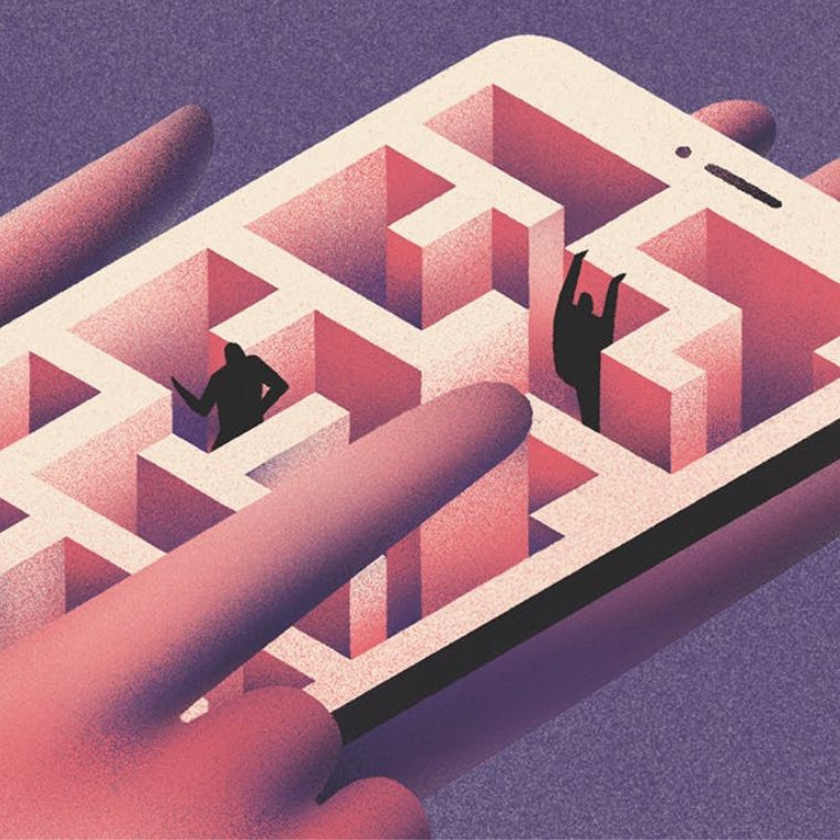
So having both under one roof brings a lot of benefits to our clients, and with that comes a broad variety of services. There’s the branding, packaging, the more classical creative business to email marketing, social, display ads, and the e-commerce – we have a lot under this roof. But it’s also a challenge. There’s a certain productive, fruitful tension between the two aspects of communication and this duality needed to be expressed by the brand. Elespacio means ‘the space’ in Spanish, and there is a lot of space at elespacio!
“Our work is extremely rational. The outcome can be luscious and playful, but design decisions are based on data”
We also wanted to express that our work is extremely rational. This is not something you hear very often in the creative world – it’s usually all about creation and seduction through imagery. But we have a very down-to-earth and analytical approach to design. We test everything. We base our decisions on data, and that’s not only the marketing team, that’s also the creative team. This analytic basis allows for a very human expression in the end. The outcome may be very luscious and playful, but the core of it is clarity.
The logo: just one simple word
We have come a long way from thinking of a ‘brand’ as a logo-type, or that thing you put on a cow’s ass! The strategy of expressing a brand as a logo, a marque or some colours is still valid and necessary, particularly when your brand is a specific product and you have a big reach among customers. You need to be recognisable.
But if your audience is much smaller and the way they have contact with your brand is through lots of different channels that don’t necessarily have a logo at the top, then that aspect becomes unimportant.
For us, we didn’t need to pay too much attention to the shape and form of a logo, so we decided to keep it as a simple word marque, using one of our two type fonts, just saying ‘elespacio’.
We chose a bold, sans serif font. And there’s a very practical consideration at the bottom of it – it often has to appear against busy backgrounds and this logo has to stand its ground. That’s why it’s fat, bold, and present. And it takes up space!
The colours: anything goes (except yellow)
“We wanted to create something open – to change and to interpretation – but still with an identity”
As with the logo, you can’t expect a small audience to constantly recognise one colour and be constantly seduced by it. And you can expect even less to be able to say something specific with a colour – there’s a very different perception of colours in different cultures. Pink means one thing in Germany and another thing in Japan – so my approach was to let go of that idea completely.
The challenge was to create something that’s open to change and to interpretation, but at the same time has an identity.
“The text appears in the three screen colours as a little tribute to our history in screen design.”
The text appears in the three screen colours – red, blue and green (a little tribute to our history in screen design). But it leaves room for change and interpretation. If you go to our website, one day it’s in red, one day in blue… and all of this is us!
Around the text, the colour universe had to contain all colours – but not randomly. It has to go with the text and we excluded some colours, such as the two yellow shades, from the spectrum. But we included strong tones, the more “dirty” shades, the pastels and the dark shades.
Everything but yellow. Poor yellow. We love yellow. But you have to draw the line somewhere.
House style: it’s all about attitude
“Our brand is more about an attitude, a character, like a human that has certain way of doing things”
Many agencies have become known for a certain design style, or a certain approach to their visual outcome.
But with us, our visual outcome is based on our clients’ words. It’s not about appearance. Our brand is more about an attitude, a character, like a human that has certain characteristics and a way of doing things.
The way we communicate tells the clients something about how we would communicate with them and how we would approach our work for them.
Tone of voice: talking the talk
“The most crucial element of the brand was a warm, approachable tone of voice”
As we weren’t focusing on creating a specific appearance, style or a memorable logo, the most crucial element of designing our brand identity was tone of voice. We defined this as very clear and approachable. Our tone of voice allows us to communicate with personality and with substance, and to inform, entertain, question and investigate.
It is clear and on point, but at the same time it has an emotional component. This is done through humour, warmth, friendliness, and by not talking down to the audience but by speaking to them at the same level. A bit of humour also doesn’t harm anyone, and it doesn’t take away from the importance of anything.
Imagery: a sensual feast
“We don’t care whether it’s photography, illustration, AI, or whatever. We just want our imagery to be tactile – imagery you can almost smell and taste”
With the imagery we wanted to express how we meet our promise: “We are crafters of stories”. And we promise to make our clients’ audience “all ears”. “So” we use imagery that is graspable, comes from a really tactile, liveable reality. We’d love it if you could smell and bite our images.
Is it illustration, computer-generated, photography, AI? We don’t care! It’s never married to a particular format or style. It’s about storytelling, it’s about an attitude, it’s about being open. That’s what the elespacio brand is all about.