Design
Into the shadows: designing emails for dark mode
July 2023The term ‘dark mode’ might sound like some dubious goings-on in the undergrowth of the internet. In fact, it just means switching the settings on your mobile device so that it’s easier on the eye. And it’s becoming more popular with users, which means we have to take it into consideration every time we design an email. Carles, our email developer, explains all and reveals his top tips on designing and developing for dark mode.
What is dark mode?
Dark mode is a setting on a mobile device such as a smartphone or laptop that switches the background of the user interface (UI) from light to… you guessed it… dark. It’s becoming more popular with users because it minimises blue light, which in turn reduces eye strain and is said to promote better sleep. It is also easier to read in low light and it’s been suggested that using dark mode could extend battery life.
As its popularity grows, dark mode is being used increasingly for email apps. The biggest challenge for designers and email developers is that the email clients that support dark mode handle it in different ways.
How do email clients apply dark mode?
As of December 2022, there appear to be three types of colour schemes that email clients use to apply Dark Mode to emails. Let’s look at them one by one:
1. No colour change
Some email clients let you change the UI to dark mode with no impact on how your HTML email is rendered. Whether the app is set to light or dark mode, your email will look exactly the same, unless you apply dark mode styles to the code. Those clients are:
- Apple Mail*
- Gmail Desktop
- AOL
- Yahoo mail
*Apple Mail doesn’t change colour modes if you leave out dark mode meta tags. If you include the meta tags but don’t apply styles, you get a partial invert.
2. Partial colour invert
The first dark mode theme is what I like to call a “partial colour invert”. It detects areas with light backgrounds and inverts them so they become dark while the dark text becomes light.
It generally ignores areas that already have dark backgrounds, which results in a fully dark design. Fortunately, most email clients that use this method also support dark mode targeting, so you can override the default dark theme.
Outlook.com is an email client that partially inverts colours, as in the screenshot below:

3. Full colour invert
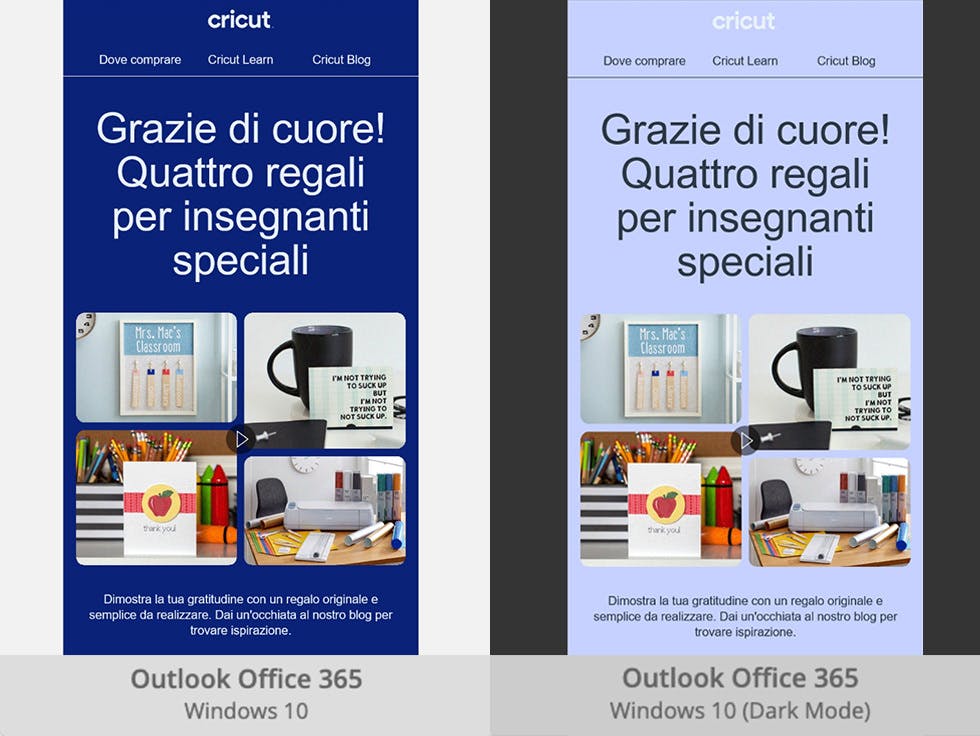
The full colour invert is the most invasive colour scheme: It not only inverts areas with light backgrounds but impacts dark backgrounds as well.
So if you design your emails to have a dark theme, this scheme will, ironically, force them to become light. Rather annoyingly, this is what happens with some of the most popular email clients such as Gmail app (iOS), Outlook 2021 (Windows), Office 365 (Windows) and Windows Mail.
In the examples below, you can see how the light backgrounds have been converted to dark versions of the original colours while areas that previously had a light text are now dark text – and vice versa.

How to design and code dark mode emails
When designing emails across different clients, there are four steps to follow to improve the experience for your subscribers.
1. Optimise your logos and images for all styles
In email clients with limited dark-mode customization, such as Gmail App and Outlook 2019, add a rounded square to transparent PNGs with dark text to make them more legible. Remember that company logos can’t be modified.
This will help prevent any issues where the email client might decide to use either the partial or full colour Invert settings — and will make things easier on the eyes. Opting for transparent backgrounds wherever possible will help.

2. Enable dark mode in email client user agents
Include the metadata below in your <head> tag. This ensures that dark mode is enabled for subscribers who have dark mode turned on:
<meta name="color-scheme" content="light dark">
<meta name="supported-color-schemes" content="light dark">
3. Add dark mode styles for @media
Add the dark mode media query (prefers-color-scheme: dark) to your embedded <style></style> section for custom Dark Mode styles in iOS, Apple Mail, Outlook.com, Outlook 2019 (MacOS), and Outlook App (iOS).
The .dark-img and .light-img classes are particularly useful for showing a dark mode-specific logo when having an outlined logo isn’t ideal.
Add this [data-ogsc] prefix styling for support in Outlook app (Android).
Have a peek at some examples for how it should look in CSS and HTML.
4. ABT: Always be testing!
When in doubt, test it out. Tools such as Email on Acid or Figma Dark Mode Magic allow you to view a mock-up of what your email might look like to users.
That’s our quick and dirty guide to designing emails for dark mode. It’s an ever-evolving field, of course, so it’s always worth testing and checking and staying up-to-date with the tools and technology to make sure your audience always gets the best experience you can give them.
Illustration: Phuwadon Thongnoum
