UX design
Ethical design: how to stay away from dark UX
November 2020UX design principles were created to help designers build digital interfaces that make users’ lives easier. They involve boxes, buttons and micro-copy that guide us to where we want to go, that tell us clearly what we need to do and help us do it with as little effort as possible. The trouble is, those same design principles can be just as easily applied to some ethically questionable practices.
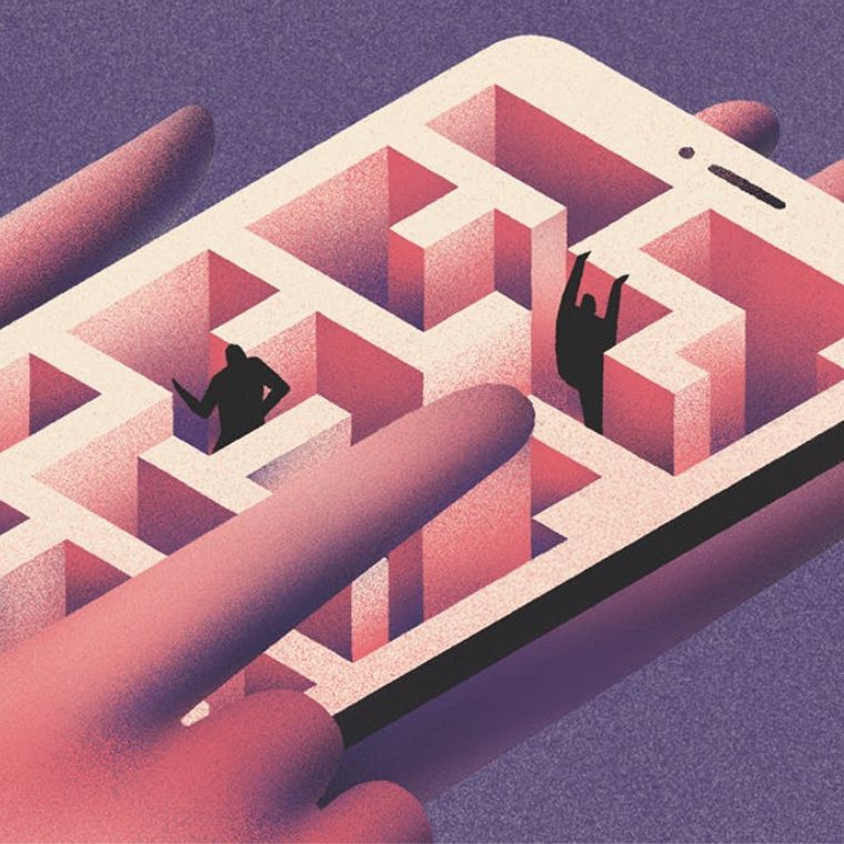
What is dark UX design? Dark UX is when interfaces are designed to trick the user. And often, it’s not deliberate or malicious, it’s just thoughtless, bad design.
What’s known as “dark UX” is when interfaces are designed to trick the user. Some do it more subtly than others. It’s just really hard to find that unsubscribe button, for instance. Or you’re shamed into signing up (you’re asked to choose between “Yes, I want offers on awesome clothes” or ‘No, I want to look like a sack of spanners”). And often, it’s not deliberate or malicious (most UX designers aren’t bad people), it’s just thoughtless, bad design.
Honest interfaces have the user’s interests at heart, rather than those of the business
As a counter to dark UX, the idea of “ethical design” was born to help create ‘honest’ interfaces that genuinely have the user’s interests at heart, rather than those of the business. It might mean the company loses out in the short term, but in the long term, by taking a customer-centric approach you will earn something valuable: trust. Ethical design is a big topic, but here are four of the main principles.
Make the get-out easy
There is little more annoying than being condemned to receiving a newsletter for eternity because it’s too painful to unsubscribe. Your email marketing strategy is no good if you need to make your customers jump through hoops. Give them a big, clear, button that says “unsubscribe”. The same goes for cancelling memberships or accounts.
Don’t make decisions for your user
Pre-selecting options in forms is a sneaky tactic. Don’t default to the opt-in for marketing communications, for example, as a way of nudging them to sign up. If you are going to default to anything, make it the opt-out, so your customer doesn’t unwittingly sign up to something that they might later regret.
Be honest about data privacy
The cookie notification box pops up so often that most of the time you click on “okay” without thinking, just to make it go away. And a lot of the time, it is designed to make you do just that. Make it clear and easy for your customer to see exactly what they are consenting to (you’re going to collect their data so you can send them personalised ads) and don’t make them hunt down your privacy policy to find that out.
Be honest about everything
Be upfront about charges such as shipping or VAT, instead of waiting until your customer gets to the checkout before you tell them. Similarly, don’t resort to fake “one-day only”, “just a few left” sales messages. And ask yourself at every point of the journey whether you are deceiving your customer in any way – even if it’s only a tiny bit, and even if it’s not deliberate. Are you deceiving them by omission? Are you deceiving them by not making things clear and easy-to-understand? Unlike dark UX, this is fundamental to ethical design: put your customer’s needs first, and remember that honesty is always the best policy.