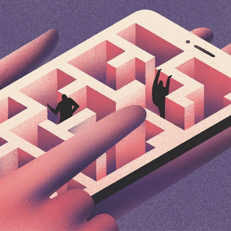
Design
Safe branding: Pretty, polished, and painfully forgettable
November 2025Open your feed and squint. See it? The sea of sameness. Soft hues, everywhere. Logos? Sans-serif, flawless. Grids? Impeccable. Taglines? Generic. Imagery? Perfectly polished. You know the look: glass shelves lined with beautifully packaged products, ethereal backgrounds… Pretty, elevated, eager to please. And yet, no spark.
Beige is easy, comfortable. You can’t really go wrong with it, can you? But today’s audiences aren’t craving easy. In a world flooded with content and choice, perfection feels lukewarm. Safe blends in. Safe scrolls by. Safe doesn’t sell, it snoozes.
In an era of endless possibilities, how did we get there?

The anatomy of sameness
It’s not one thing, but a convergence. Technology, psychology, profit, and design, all pulling in the same direction; toward what feels familiar, efficient, and safe.
The algorithm effect
Just like Netflix keeps serving up the same crime dramas, Amazon the same products, and Spotify the same songs we’re unlikely to skip, algorithms feed us what’s already working. As New Yorker writer Kyle Chayka points out, this machine-led curation has turned us into docile consumers and flattened our likes and tastes. The result? A creative echo chamber where everyone scrolls the same feed, binges the same shows, and everything starts to blur together.
Comfort in repetition
Humans like what feels familiar, it’s a survival trick. If it hasn’t eaten us yet, it’s probably safe. That instinct spills into branding too. Psychologists call it the ‘mere exposure effect’: the more we see something - whether it’s a product, a logo, or even a face - the more we tend to like it, as our brains are naturally more comfortable with things they recognise. When we’re drowning in a stream of constant newness, clinging to what’s familiar feels like a life raft. Neutrality is cosy. Specificity? Oof, risky.
The inspiration loop
Designers today swim in the same pools: Pinterest, Behance, Instagram. With endless reference imagery at our fingertips, it’s no wonder we keep circling back to the same aesthetics. The platforms democratised inspiration, but they also standardised it.
Playing it safe for profit
In the chase for mass appeal, brands often flatten themselves into something blandly universal. The logic goes: speak to everyone, sell to everyone. The reality? You end up speaking in a language so generic it could belong to anyone. Instead of forging real connections, you’re left with content that slides past people’s eyes without leaving a mark.
Less is bore
Then, layer in the realities of modern design: mobile-first layouts that shrink ideas into thumbnails, and accessibility checklists that favour clarity over character. The result? A wave of simplified logos and stripped-down branding, what’s been coined ‘blanding’: when distinctiveness gets sanded down in the name of universality. Functional? Absolutely. Emotional? Not so much.
“When everything pulls toward what’s safe and familiar, creativity stops moving forward.”

Vanilla branding doesn’t come cheap
Research keeps pointing to the same truth though: standing out isn’t just nice for your brand, it’s good for business and delivers tangible return on investment. High-quality creative drives over 4 times more profit than low-quality work, according to a study by WARC and Kantar. And McKinsey backs it up: companies that put creativity at the heart of their strategy see 67% higher organic revenue growth than their peers.
And here’s where it really hurts: being boring doesn’t just fail, it gets expensive. Marketing expert Adam Morgan calculated that a dull campaign could cost you an extra £10 million a year in media spend just to keep up with the performance of an interesting one. Yikes!
So how do we get heard through the noise? Start by facing the truth: safe is the new risky. Minimalism isn’t the enemy here, but blending in could cost you dearly. Sure, washed-out branding won’t ruffle any feathers, but it certainly won’t make you unforgettable. Would you rather be disliked by some, or be invisible to all?
“Safe is the new risky. When everything looks the same, blending in isn’t protection, it’s invisibility.”

Don’t Just Stand Out, Stand Apart
Here’s the good news: sameness doesn’t have to be a curse. With 85% of creative ads falling flat, and 72% of customers struggling to tell brands apart, the bar is quite low. Think of it as a creative challenge; it’s the perfect time to stand out. Because branding isn’t the icing on the cake, it’s the recipe that makes people crave a slice in the first place.
This is where psychology kicks in. The Von Restorff Effect tells us that our brains are wired to notice what’s different. When everything blurs together, the odd one out is what gets remembered. But let’s be clear: being different for its own sake isn’t the point. Distinctiveness is. Coke and Pepsi aren’t galaxies apart, but both are unmistakably themselves. As Dr Byron Sharp puts it, distinctiveness is “a brand looking like itself.” It’s about making your brand instantly recognisable, building not just a look, but a feeling. Speaking with a voice so uniquely yours that people could recognise you blindfolded.
“Looking like yourself is the most strategic move you can make.”

Make ’Em Feel
In the race to maximise reach and conversion, brands have forgotten something crucial: people don’t remember what made sense, they remember what made them feel. Repetition and reach alone won’t build love, connection and emotion will.
That’s why resonance matters more than perfection. People don’t connect with pixel-perfect polish; they crave spark, tension, personality. Be authentic and sincere, it’s all about being relatable and building a strong emotional bond with the right crowd. Let your brand act like a person, with its quirks, opinions, imperfections, and a heartbeat. Be clear on what you stand for, even if that means not pleasing everyone. Live up to your values consistently, from your products to your customer service. Build a community around you, and invite people to be part of your journey. And never underestimate the power of a story well told, because that’s what makes brands stick. Emotion drives memory far more than flawless art direction ever will.
To get there, you’ll need to make space for creativity. Stop chasing trends and start making meaning. Explore alternative approaches, take risks, and allow yourself to shine in ways your industry hasn’t dared. When the creative landscape feels dull and bland, the brands that bring colours and joy will turn heads. Look for inspiration outside your usual design rabbit holes, dip into architecture, fine art, music, history.
Dare to be bold, defy expectations. Breaking free from beige isn’t about adding more polish, it’s about showing more soul.
References
Kyle Chayka - Filterworld https://www.houstonpublicmedia.org/npr/2024/01/17/1224955473/how-social-media-algorithms-flatten-our-culture-by-making-decisions-for-us/
Harvard Business Review - The New Science of Customer emotions https://hbr.org/2015/11/the-new-science-of-customer-emotions
Byron Sharp - How Brands Grow: What Marketers Don't Know https://marketingscience.info/how-brands-grow/
McKinsey - Creativity’s bottom line: How winning companies turn creativity into business value and growth https://www.mckinsey.com/capabilities/mckinsey-digital/our-insights/creativitys-bottom-line-how-winning-companies-turn-creativity-into-business-value-and-growth
WARC - Over 80% of ads fail to reach 'attention threshold' https://www.warc.com/content/feed/over-80-of-ads-fail-to-reach-attention-threshold/en-GB
VML Intelligence - The future 100: 2025 https://www.vml.com/insight/the-future-100-2025
Adam Morgan and Peter Field - The Cost of Dull https://radiopub.fr/wp-content/uploads/2025/02/01.27.25-Dullness-Of-Ads.pdf